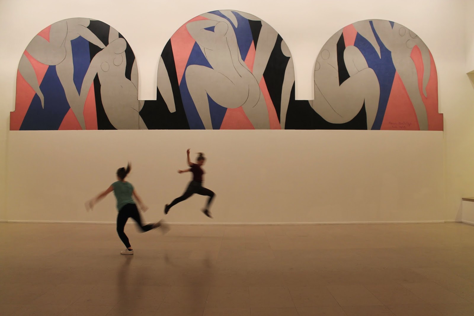
This term has been a great mixture of experimenting new things, coming up with ideas and creating outcomes. I am happy with my final posters, I think they are in the best range of work I have created this year in Graphics. I have developed my skills in Photoshop, Indesign, drawing, photography and many other types of design. I think I have improved on taking a design further, I have taken themes and developed the colours, material and style of the first design to make it better. I have found a good way of working and trial and error is always useful. I am glad I got to focus on something special to me in this final project as it enticed me to find out more, this also helped me as I have been doing dance for over 15 years now and have connections in the industry. Many of my friends can dance, this helped me a lot with my photography. I feel that I used a range of skills in this project from drawing and sketching, computer skills, photography, and my graphic design skills have definitely improved. I based the festival in Paris as I have visited it recently, I have images in the beautiful City and it is a great location for a dance festival. Visiting different Cities during this project really inspired me, I went to Berlin and Paris. It was lovely to see the contrast and similarities with the art and to visit exhibitions of foreign artists. Artists and photographers who specifically influenced me for this project are: Robert Mapplethorpe (one of my favourite photographers), Edgar Degas, Henri Matisse, Alfred Eisenstaedt, Patrick Mcgannon and Greg Gorman. Another general graphical influence is Steve Edge. I also found influence in books, performances, friends, fellow students and galleries.
I think the project went well in terms of what I could produce with the time I was given. I worked hard on the posters and I experimented with my different photographs and different techniques on the computer and sketching as well. It was hard to find a poster that looked right for what I was going for. I wanted it to have class as well as look fun and interesting at the same time as being inviting. After many tries I think I found the best layout, colours and image put together for the festival that was in my mind. This made me better and noticing what is good together and what clashes in graphic design.
I would have liked to do more on this project, if I had more time and money I would have focussed more on branding and made some dance related clothing and other merchandise. I also would have liked to make a short film of a performance, possibly of my choreography. Another idea was to make a model stage that would have been at the festival, where the dancers would have performed. If I were to do things differently I would have been quicker with choosing a final theme and been able to succeed in completing one of these more elaborate ideas. I also would have liked to have access to a more professional camera as my one takes good photographs but not to the professional standard that could be met with a more updated one.